“Dumbed-Down” Brand Logos More Effective? Find Out Why!
Did you know that the first logos were actually ancient Egyptian hieroglyphs?
This symbolic form of communication consequently evolved into the art of heraldry. Armies would use colours and symbols to distinguish between the various houses and sides in a war (think Game of Thrones!).
As time passed, royal families and the European aristocracy began to use intricate symbols on their coats of arms as a way of projecting status.
Soon, in the 20th century, these colourful and meaningful symbols became representative of companies and corporations and began to be known as logos.
They led the way to a revolution in advertisement and branding that every company clings to till this day.
BUSFAM, branding agency in India, takes a closer look at how logos have evolved over the years and how they’ve currently become pretty simplified, or “dumbed down”.
Logos Used to Be Meaningful and Rich in Visual Communication
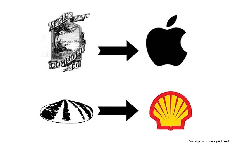
Logos started off complicated. Think of the first Apple Inc. logo of Isaac Newton under a tree. It was nothing close to the flat logo of an apple with the bite taken out of it that we all see and recognise today.
Take it as you will, but frankly, the hidden meanings, the puns, and the laugh-out-loud reactions are all gone from the art of logo-making.
So, did you know why the oil company Shell has the logo of a sea mollusc?
It’s because the founder’s father used to sell shells to collectors in London. Quite a poignant way of acknowledging the hard work of one’s old man, isn’t it?
What about the story of Levi’s logo of 2 horses trying to rip apart a pair of jeans? It indicated the strength and quality of the product in a very clever way!
However, as this branding agency in India, and others have noticed, logos have slowly but surely become less symbolic. They are text-rich and use colours rather than cleverness and brand names instead of imagery.
What Does the Present Logo-Making Scene Look Like?
At present, logos are oversimplified. They are communicating next to nothing except the name of the brand.
If you look at the logos of various MNCs, they have a staid use of lettering in clean sans serif fonts and little to no emotional or humorous appeal.
Right now typographic logos are all the rage.
Think of the big tech companies like IBM, Google, Dell, Intel, HP, and a whole lot more. They make use of simple lettering only.
Also, they all seem to be choosing the same colours. This doesn’t make the brand stand out but rather blend in.
Take a look at the logos of the news channels in India. Would you be able to tell them apart given that the most popular of them follow the same colour schemes?
Branding agencies in India seem to have taken a break it seems!
Is There a Reason for the Oversimplification of Logos?
Logos nowadays are minimal and simplified, is there a reason for this shift?
Yes.
The consumer of today has changed.
They are bombarded with several brands, each trying to ensure that their name is recalled.
So, doesn’t it make sense to just use the name instead of a complicated graphic that people won’t have the time to associate with the brand anyway?
There’s a limit to a person’s memory after all, and a simple logo that is rich in text (for example Weightwatchers’ old logo) will resonate more with the people.
Also, this happens to be the trend and several branding agencies in India are on it.
There exists another reason behind the simplification of logos.
As a brand grows, less is apparently more. The essence of good design is a simple design, and brands recognise that they can communicate a lot with just a few elements.
So, Has Creativity Gone Out of the Window?
It’s not about creativity having gone out of the window. It’s about what this generation understands, recalls, and how they deal with brands.
When GAP changed its logo, most people didn’t even notice it!
So, given that consumers are paying less attention to the logo, it’s only natural that logos should become simple and reflect the essence of the brand effectively.
However, it doesn’t mean that there isn’t a place for a symbolic, image-rich logo.
In our opinion, there’s no way of telling which way this trend will go.
Conclusion
At BUSFAM, we are adept at designing logos which you can check out on our Behance account. As one of the premier branding agencies in India, we love a good story behind an advertisement and logo.
We do stay with the times as well and design simplistic logos that convey a lot with a little.
Reach out to us for more information on logo design!