Redesigning of the Most Iconic Logo after 60 years: Nokia
Why does a company rebrand itself? The answer to it could vary from brand to brand but the most common one is company growth. Other reasons involve new management, a bad reputation or an outdated image or system.
Whatever the reason, it's important to create a stellar brand that people will remember for a long time. Taking this opportunity Nokia is changing its logo for the first time in 60 years indicating and accelerating a change in their business strategy.
Rebranding a business to reflect a change in strategy and bring all the focus on the upgradation has long been a great corporate strategy. Nokia has adopted a similar strategy. Lets understand the strategy better and the reason behind the execution.
The Big News
Nokia, a mobile company that pioneered camera phones in India, has announced a plan on changing its logo followed by a change in strategy and business model. The company is to change its brand identity for the very first time in 60 years with a completely new logo, as the telecom equipment creator focuses on aggressive growth of the company after ruining its market value in collaboration with Microsoft for many years.
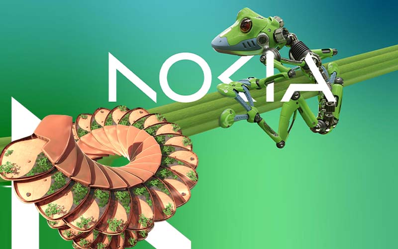
The new logo is made up of five different shapes forming the word the brand name NOKIA. The prominent blue colour of the old iconic logo has been dropped and replaced with a range of colours depending on the use.
Along with redesigning the logo, the CEO of the company announced a three-phase strategy when he conjectured leadership of the Finnish corporation Nokia in 2020. The three phase strategies are reset, accelerate, and scale.
Why did Nokia choose to Redesign and Rebrand itself?
Nokia, a manufacturing company of 5G equipment in Finland, refurbished its logo to distance and disassociate itself from the mobile phone industry, which it stepped away from for more than 10 years.
Nokia is now a new business technology company according to the CEO, and no longer a maker of smartphones.
On the eve of the annual Mobile World Congress (MWC), which was held in Barcelona, the CEO not only disclosed the new logo but recounted how the company expects networks to change over the next few years and how it plans to adapt to the new changes.
Change in Strategy
Nokia is willing to expand its business that deals with service providers. It broadly consists of selling equipment to telecom providers, but their primary objective is to sell equipment to other firms.
The company had a good 21 per cent growth last year in the enterprise, that is currently about eight percent of their sales, which makes 2 billion euros roughly.
The company is looking forward to taking that to double digits as quickly as possible.
The majority of their client base are in the manufacturing sector, hence the major technology companies have started collaborating with their telecom equipment manufacturers to give private 5G networks and equipment for automated factories.
Providing network equipment to wireless service providers, the CEO of the company stated that Nokia will concentrate on growing its market share in the company's operations. Nokia now has the ammunition and the required tools to gain market share without compromising on the margins.
Nokia also plans on evaluating the development of each of its companies and exploring alternatives. The company sees a potential in digital prowess to transform businesses, industry and society with an opportunity for significant gains in productivity, sustainability, and accessibility. Their market-leading critical networking technology is progressively required by the customers and the partners in the industry.
Last but not the least the company sees a future where the network is more than just connecting people and things. They’re adaptable, autonomous and consumable. They can sense, act, think, and maximise the opportunity of digitalisation.
Market Competition
The strategy and the redesigning of the logo will build a positive market competition. Many branding agencies in India privately applaud this as a successful branding strategy.
Nokia's incursion towards data centres and factory automation would put them in competition with major IT giant companies.
Conclusion
The company’s new logo is parabolic of energetic, dynamic, zestful and modern business technology company that has expertise in providing 5G network services and industrial digitization.
It demonstrates its values and purpose through the change. It has been designed as a symbol of collaboration, that Nokia believes to be critical for realising the ascending potentials of the network unlocking the profit in sustainability, productivity, and accessibility.
Nokia has finally put an end to its more than 10-year fight in junk status.
Source: Nokia